Introduction
My chaiwala has a better user experience than my government.
He has a laminated QR code taped to his cart. I scan it, type 15, enter my PIN, and a little speaker announces that he got paid before I've even taken a sip. My grandparents can do this. Ten-year-olds can do this. In October 2026, India did it 25.47 billion times, roughly 822 million transactions a day (Free Press Journal).
Now try uploading a photo to a government portal. It must be a JPG. Under 50 KB. Exactly so many pixels wide. Then the CAPTCHA, which looks like it was drawn during an earthquake. Then "Session expired". Then you start over. (I just booked tickets on IRCTC. I'm still recovering.)
Same country. Same users. Same phones. So why does one feel like magic and the other feel like a punishment?
Don Norman answered this in 1988, in the book we now know as The Design of Everyday Things. He just used doors instead of payment apps.
Norman's big idea: it's not you, it's the design
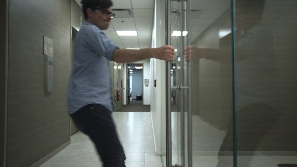
You know those doors where you push and they need a pull? Designers literally call them Norman doors, after Don Norman. His point was simple and a little rebellious. When people keep making the same mistake, the people aren't stupid. The design is.
Norman argued that good design does a few things really well:
- Signifiers: it shows you what you can do. A flat plate on a door says push. A handle says pull.
- Feedback: it tells you, immediately, what just happened.
- Mapping: controls match their effect, so you don't have to think.
- Constraints: it makes the wrong action hard or impossible.
- A clear conceptual model: you can picture how the thing works, so you can predict it.
He also described two gaps every user has to cross.
- The gulf of execution: "how do I do what I want?"
- The gulf of evaluation: "did it work?"
Good design shrinks both. Bad design makes you jump.
Keep those in mind. UPI nails almost all of them. Most government websites miss almost all of them.
Why UPI works
The QR code is the perfect signifier. A square of black dots taped to a wall says one thing: point your camera here. No instructions needed. It has become so universal that a QR sticker on a shop counter now means "we take UPI" the way a door handle means "pull".
The feedback is ridiculous, in the best way. You get a green tick, a sound, a confirmation screen, an SMS. And the shopkeeper gets a speaker on the counter shouting the amount out loud. That soundbox solved a very Indian problem: "Did the money come?" Nobody has to squint at a phone or wait for a message. The gulf of evaluation is basically zero.
The mapping is human. You pay a phone number, a name, or a face you can see standing in front of you. Not an IFSC code and a 16-digit account number. The thing you type matches the person in your head.
The constraints protect you. Short PIN. You see the receiver's name before you pay. Wrong amounts are easy to catch. It's hard to mess up, which is exactly the point.
The conceptual model is one sentence. Scan, amount, PIN, done. Four steps. You can teach it in thirty seconds, which is why it spread from metros to vegetable carts.
Why government websites don't
Run the same checklist on a typical government portal and it fails almost every line.
No signifiers. The homepage has forty links, three marquees scrolling news from 2019, and a "Click Here" button that could mean anything. Where do I actually start? Nobody knows. That's the gulf of execution, and it's a canyon.
Feedback that tells you nothing. You submit a form and get "Error occurred. Please try again." Which field? What error? Try again how? Or worse, it just spins. Did it go through? Should you click again and pay twice? The gulf of evaluation is where hope goes to die.
Mapping built for the system, not you. The form asks for your "Applicant Category Code" and your "Sub-Division Office". You don't think in those words. The department does. The site makes you translate yourself into its filing system.
Constraints that punish instead of protect. Good constraints stop mistakes before they happen. Government sites tell you after. You fill in twenty fields, hit submit, and only then learn your photo was 51 KB instead of 50, and the whole form is now blank.
The CAPTCHA is the perfect example. To be fair, it exists for a reason. Portals get hammered by booking bots, and something has to stop them. But making every human prove they're human is the laziest fix. Invisible checks can score how a user moves and types in the background, and only show a puzzle when something looks off. Rate limits and the OTP these sites already send do a lot of the same work. A good constraint makes bots suffer, not people.
No conceptual model at all. Is this a website, or a scanned paper form wearing a website costume? Usually the second. It copies the offline process step by step, queue and all, just without the chair to sit on.
Norman would look at all this and say: the users aren't failing. The design is.
Why this happens: who is it designed for?
Here's the twist. UPI is also a government-backed system. NPCI built the rails. So "government can't design" isn't the answer.
The real difference is who each product has to please.
UPI apps have to win you. PhonePe, Google Pay, Paytm and every bank app are fighting over the same phone screen. If paying feels slow or confusing, you switch apps in thirty seconds. That competition forces every app to obsess over one tap, one sound, one second.
A government portal doesn't have to win anyone. You need your certificate, so you'll suffer through it. There's no second passport office app to switch to. Without that pressure, the site gets designed for whoever signs off on it: the department, the procurement rules, the audit trail. The citizen is the last stakeholder in line, even though they're the only one using it.
Norman has a line of thinking for this too. Designers who never watch real people use their product end up designing for themselves. And nobody in that sign-off chain is the auntie trying to upload a photo from a cyber café at 6 pm.
That's the rule I try to build by. Before I ship anything, I ask one question:
Could someone use this tired, on a bad network, with one hand, without asking for help? If not, it isn't done.
How to fix it
The good news: none of this needs new technology. UPI proved India can build world-class digital experiences. It just needs to aim the same care at a passport form. Norman's principles turn into a pretty practical to-do list.
| Today | Could be |
|---|---|
| Error after you submit 20 fields | Each field checked as you type |
| "Photo must be under 50 KB" | Photo shrunk automatically |
| "Error occurred. Try again." | "Your PIN code doesn't match your district" |
| Session expired, form wiped | Autosaved, pick up where you left off |
| No idea where your application is | "Verified. Printing. Dispatching Friday." |
And no, this doesn't need fancy servers. Your browser can shrink a photo on your own phone before it's even uploaded. It's a few lines of code.
Conclusion
Here's the real proof UPI works: it became a verb. Nobody says "I'll NEFT you" or "let me RTGS it." But "UPI kar do" is everywhere. When people turn your product into a verb, the design has disappeared into habit. That's the highest compliment design can get.
Norman wrote his book about doors and teapots, but the lesson scales to a billion people: when users struggle, look at the design before you blame the user. India has already built one of the best-designed payment systems in the world. The same country can build a form that doesn't eat your photo.
Until then, I'll keep compressing my photo for the third time on some portal. And then I'll walk to the chai stall, scan the QR code, and get the one interaction in my day that just works.
"Bhaiyya, 15 rupees, UPI kar diya!"
Sources
- Don Norman, The Design of Everyday Things (first published in 1988 as The Psychology of Everyday Things; revised and expanded edition 2013)
- "UPI Transactions Hit 25.47 Billion In October", Free Press Journal